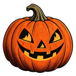
Some Halloween images feel instantly familiar even when we have never seen them before. A witch crossing a harvest moon. A pumpkin glowing on a porch. A black cat pausing on a fence. These scenes have a visual language that feels old, but never out of date.
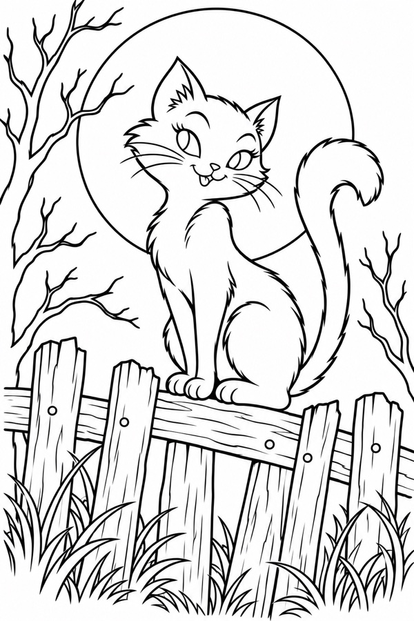
The power of a clear silhouette
Vintage Halloween illustrations often read at a glance. The witch has a pointed hat, the cat has an arched back, and the moon sits in a generous field of night. The shapes are simple enough to remember, but expressive enough to suggest a story.
That clarity is one reason the artwork feels modern. In a crowded visual world, a strong silhouette creates instant recognition. It does not need a paragraph of explanation or a complicated background to do its work.
A limited palette leaves room to imagine
Old printed artwork was shaped by its materials and processes. Fewer inks meant fewer colors, and those limitations created a particular kind of harmony: pumpkin orange against charcoal, warm cream beside muted gold, a small accent of green or rust.
When every color has a job, the image becomes quieter — and the imagination becomes louder.
Texture makes an image feel collected
Paper grain, slightly uneven ink, and the softness of a printed edge tell us that an image has a history. Even a digital illustration can borrow that feeling through restrained texture and a material-led composition.
The important word is restrained. Texture should support the drawing, not compete with it. A little imperfection can make a page feel human; too much becomes a filter.
The mystery is in what stays unsaid
The best vintage Halloween scenes do not show everything. A lit window appears behind the trees. A path disappears beyond the fence. A cat looks just past the edge of the frame. These details invite the viewer to finish the story.
That balance — familiar but not fully explained — is what keeps the imagery timeless. It gives the viewer a place to enter, whether they are looking at a postcard or choosing a page to color on a quiet evening.